
Particle Connect Customization
Particle Connect is the suggested SDK for driving generalized onboarding, supporting both social logins and standard wallet connection through a single interface. Importantly, it allows deep programmatic visual customization when initializing the SDK withcreateConfig in the ConnectKitProvider component.
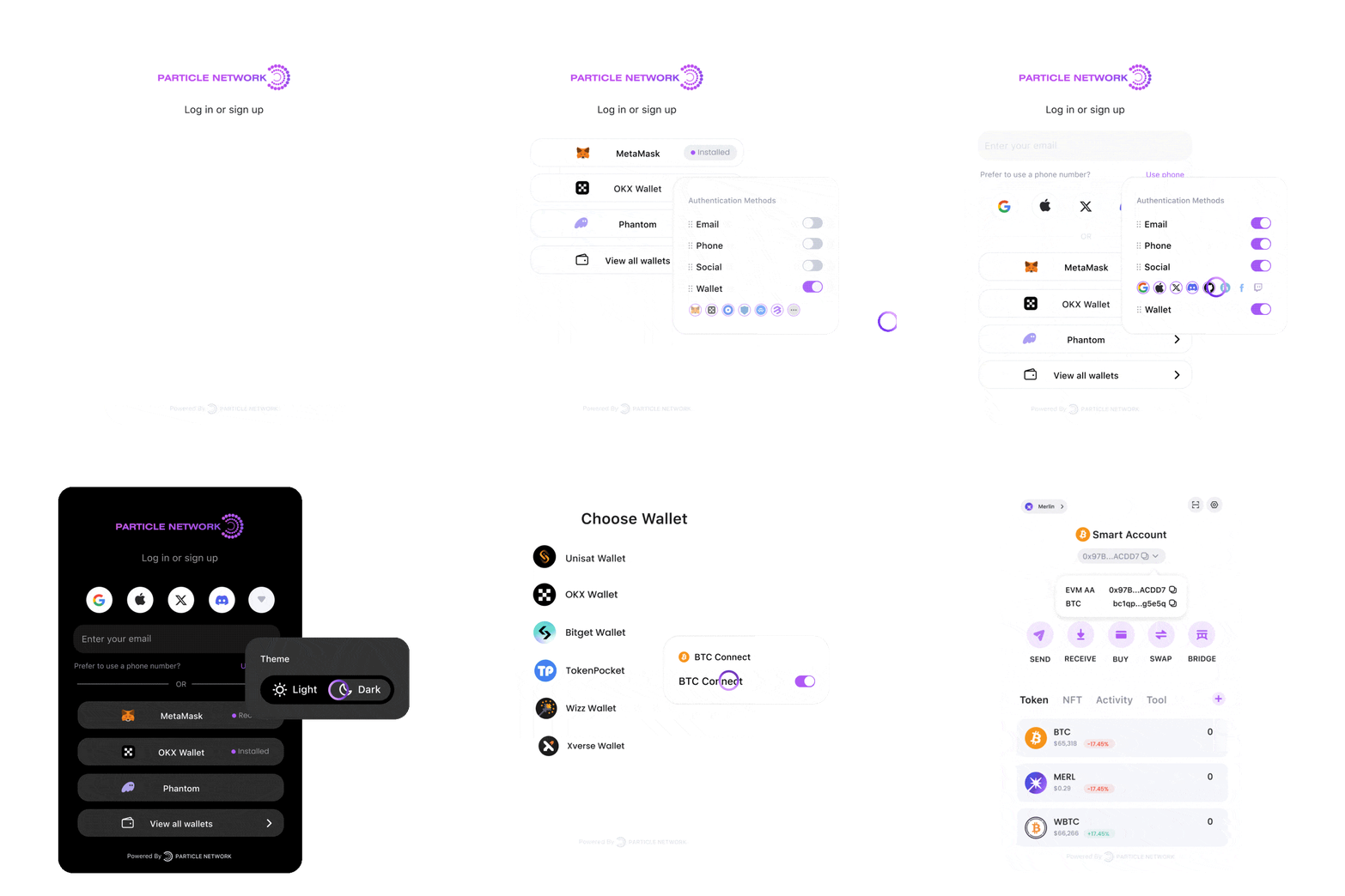
mode parameter within createConfig, selecting the interface language using language, or specifying a custom logo through logo, among others.
For more granular control, deeper customization is available through the theme parameter, part of the appearance object in createConfig.
The theme object accepts the following options:
ConnectKit.tsx
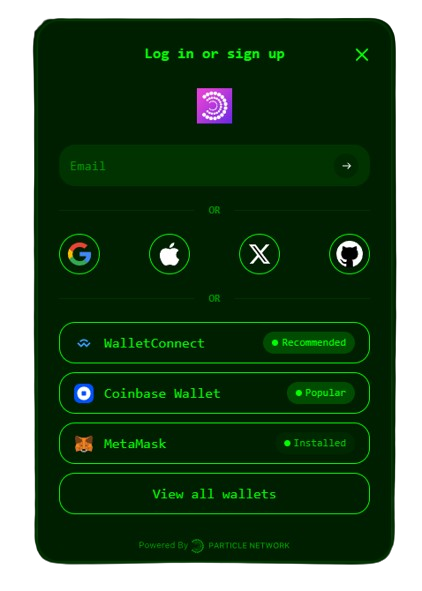
Materialization of the above parameters for Particle Connect.
Customizing the ConnectButton Text
Particle Connect enables you to customize the text displayed on the ConnectButton component used for user login.
To modify the text, add the label prop to the ConnectButton component:
Particle AuthKit Customization
As an alternative to Particle Connect, Particle Auth (@particle-network/authkit) offers a dedicated modal containing exclusively social logins. The most common way to customize this interface is through programmatic style definitions, which can be applied during SDK initialization through the AuthCoreContextProvider component, as will be demonstrated below.
You can achieve high-level customization by adjusting parameters such as themeType for light or dark mode within AuthCoreContextProvider, language to set the language of the modal, and fiatCoin to choose the fiat currency display.
For more advanced customization, the customStyle parameter in the options object of AuthCoreContextProvider offers deeper control. The customStyle parameter accepts the following options:
customStyle
ThemeStyle object allows you to customize the appearance of the authentication modal and transaction popups. It provides options for defining various visual elements, including colors, backgrounds, borders, and more.
The ThemeStyle object accepts the following properties:
ThemeStyle
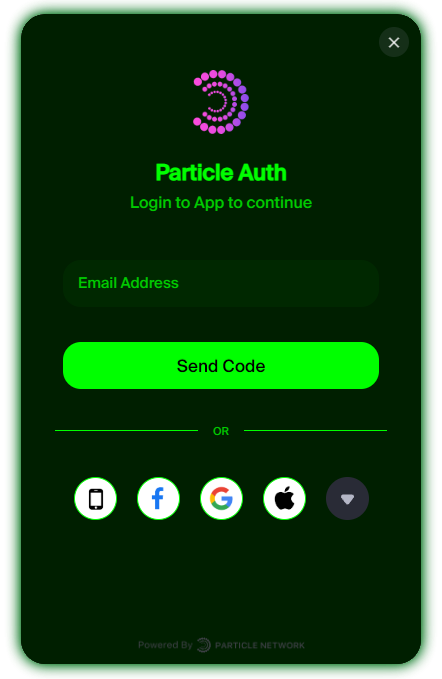
Materialization of the above parameters for Particle Auth.