> ## Documentation Index
> Fetch the complete documentation index at: https://developers.particle.network/llms.txt
> Use this file to discover all available pages before exploring further.
# Customizing Wallet Modal
> Customizing the appearance of the Particle Wallet modal.
In addition to complete customization of Particle Auth (specifically the authentication and transaction confirmation menus), **Particle Wallet can also be deeply customized**. Particle Wallet acts as the **primary **(yet optional)** interface for users to interact with the wallet generated by Particle Auth**. While not all applications use Particle Wallet as a direct mechanism of wallet management, it's a solid option given the aforementioned customization potential, thus making the wallet modal feel specific to your application and project. This document will dive into the programmatic customization of Particle Wallet.
***
## Programmatic Customization
Particle Wallet can only currently be customized through strictly set parameters, either within the path of [https://wallet.particle.network](https://wallet.particle.network), or within the configuration of Particle Authkit or Particle Auth Core (which would translate to the in-UI modal rather than a redirect such as is the case with [https://wallet.particle.network](https://wallet.particle.network)).
`customStyle` takes the following parameters, all of which impact the appearance of the wallet modal:
```javascript JavaScript theme={null}
supportChains?: Chain[];
supportAddToken?: boolean;
displayTokenAddresses?: string[];
displayNFTContractAddresses?: string[];
priorityTokenAddresses?: string[];
priorityNFTContractAddresses?: string[];
fiatCoin?: CurrencyUnit;
evmSupportWalletConnect?: boolean;
supportUIModeSwitch?: boolean;
supportLanguageSwitch?: boolean;
light?: ModeStyle; // Profile 1, light mode
dark?: ModeStyle; // Profile 2, dark mode
```
The `ModeStyle` object provides a flexible way to customize the look and feel of the wallet modal and transaction popups. You can tailor the interface to match your brand by adjusting the following properties:
```ts theme={null}
colorAccent?: string;
colorPrimary?: string;
colorOnPrimary?: string;
primaryButtonBackgroundColors?: [string, string];
primaryIconButtonBackgroundColors?: [string, string];
primaryIconTextColor?: string;
primaryButtonTextColor?: string;
cancelButtonBackgroundColor?: string;
backgroundColors?: [string, [[string, string], [string, string]]];
messageColors?: string[];
borderGlowColors?: string[];
modalMaskBackgroundColor?: string;
cardBorderRadius?: number;
```
### Particle Connect
To customize the wallet modal in Particle Connect, you need to include the `customStyle` object within the `plugins` array in the `ConnectKitProvider` configuration.
```tsx ConnectKit.tsx theme={null}
plugins: [
wallet({
entryPosition: EntryPosition.TR,
visible: true,
themeType: "dark",
customStyle: {
themeType: {
dark: {
colorAccent: "#7DD5F9",
colorPrimary: "#21213a",
colorOnPrimary: "#171728",
primaryButtonBackgroundColors: ["#5ED7FF", "#E89DE7"],
primaryIconButtonBackgroundColors: ["#5ED7FF", "#E89DE7"],
primaryIconTextColor: "#FFFFFF",
primaryButtonTextColor: "#0A1161",
cancelButtonBackgroundColor: "#666666",
backgroundColors: [
"#14152e",
[
["#e6b1f766", "#e6b1f700"],
["#7dd5f94d", "#7dd5f900"],
],
],
messageColors: ["#7DD5F9", "#ed5d51"],
borderGlowColors: ["#7bd5f940", "#323233"],
modalMaskBackgroundColor: "#141430b3",
},
},
},
})
],
```
### Particle Authkit
Customizing Particle Wallet through configuration within Particle Authkit can be done within the initialization of `AuthCoreContextProvider` from `@particle-network/authkit`. Within this component, you'll need to head into the `customStyle` object within the `wallet` parameter on `options`.
With this in mind, take a look at the below example for further insight into what a complete utilization of most of the above parameters looks like (example of a configuration for `customStyle`):
```javascript JavaScript theme={null}
customStyle: {
supportAddToken: true,
supportChains: [
{ id: 1, name: "Ethereum" },
{ id: 5, name: "Ethereum" },
{ id: 56, name: "BSC" },
{ id: 97, name: "BSC" }
],
evmSupportWalletConnect: true,
supportUIModeSwitch: false,
supportLanguageSwitch: false,
priorityTokenAddresses: [""],
priorityNFTContractAddresses: [""],
light: {
colorAccent: "#F23892",
colorPrimary: "#ffffff",
colorOnPrimary: "#ffffff",
primaryButtonBackgroundColors: ["#F23892", "#F23892"],
primaryButtonTextColor: "#ffffff",
primaryIconButtonBackgroundColors: ["#dfe9fd", "#dfe9fd"],
primaryIconTextColor: "#F23892",
cancelButtonBackgroundColor: "#666666",
backgroundColors: ["#e5e5e5", [["#ffffff00", "#ffffff00"], ["#ffffff00", "#ffffff00"]]],
messageColors: ["#7DD5F9", "#ed5d51"],
borderGlowColors: ["#7bd5f940", "#323233"],
modalMaskBackgroundColor: "#141430b3"
},
dark: {
colorAccent: "#7DD5F9",
colorPrimary: "#21213a",
colorOnPrimary: "#171728",
primaryButtonBackgroundColors: ["#5ED7FF", "#E89DE7"],
primaryIconButtonBackgroundColors: ["#5ED7FF", "#E89DE7"],
primaryIconTextColor: "#FFFFFF",
primaryButtonTextColor: "#0A1161",
cancelButtonBackgroundColor: "#666666",
backgroundColors: ["#14152e", [["#e6b1f766", "#e6b1f700"], ["#7dd5f94d", "#7dd5f900"]]],
messageColors: ["#7DD5F9", "#ed5d51"],
borderGlowColors: ["#7bd5f940", "#323233"],
modalMaskBackgroundColor: "#141430b3"
}
};
```
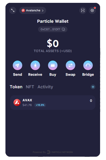
This specific custom style above translates into a highly customized version of the wallet model, with gradients, major color changes, and feature removals, as shown in the following image.
Try out an [interactive demo showcasing custom styles](https://web-demo.particle.network).
## Customizing the Wallet Entry Point
Additionaly, you can tailor the location in which the embedded wallet interface will open; in doing so, you can create a custom **Open Wallet** button or merely alter the position of the default Particle Network button.
Find a full Next.js demo in the [Customizing Wallet Position repository](https://github.com/Particle-Network/custom-wallet-entry).
### Option 1: Alternative Position for Default Button
If you prefer to keep the default button responsible for opening the embedded wallet (circular button with the Particle Network logo, in the bottom right corner by default), you have the option of altering where on the page it'll sit.
To do this, you'll need to alter the `wallet` property of `AuthCoreContextProvider` (from [Particle Auth](/social-logins/auth/quickstart/web-quickstart)) and designate a position through `entryPosition`, which takes `EntryPosition` from `@particle-network/wallet`.
You have the choice between opening the wallet in the bottom right (`EntryPosition.BR`), bottom left (`EntryPosition.BL`), top right (`EntryPosition.TR`), or top left (`EntryPosition.TL`).
```javascript theme={null}
import { AuthCoreContextProvider } from "@particle-network/authkit";
import { EntryPosition } from "@particle-network/wallet";
export const ParticleAuthkit = ({ children }: React.PropsWithChildren) => {
return (
{children}
);
};
```
### Option 2: Custom Wallet Entry Point with openWallet()
The `openWallet()` method imported from `useAuthCore()` triggers the opening of the wallet modal, independent from the default button referenced above.
You can create your own custom wallet entry, such as a button labeled **Open Wallet**. When clicked, this button will trigger the modal using the `openWallet()` method.
Set the `visible` property to `false` in `AuthCoreContextProvider` if you want to hide the default **Particle Button**.
```jsx theme={null}
const { openWallet } = useAuthCore();
// Open the wallet modal from a custom button
const toggleParticleWallet = async () => {
openWallet({
windowSize: 'small',
topMenuType: 'close',
});
};
```