> ## Documentation Index
> Fetch the complete documentation index at: https://developers.particle.network/llms.txt
> Use this file to discover all available pages before exploring further.
# Customizing Login Modal
> Customizing the appearance of Particle's login modal.
**Particle Network** places a strong emphasis on **deep customization and application-specificity**. Whether it’s logos, colors, or border sharpness, virtually every aspect of Particle's native login interface can be tailored programmatically using **Particle ConnectKit** or **Particle AuthKit**. This guide will explore the various methods available for customizing these modals to meet your specific needs.
***
## Particle Connect Customization
[**Particle Connect**](/social-logins/connect/quickstart/web-quickstart) is the suggested SDK for driving generalized onboarding, supporting both social logins and standard wallet connection through a single interface. Importantly, it allows deep programmatic visual customization when initializing the SDK with `createConfig` in the `ConnectKitProvider` component.
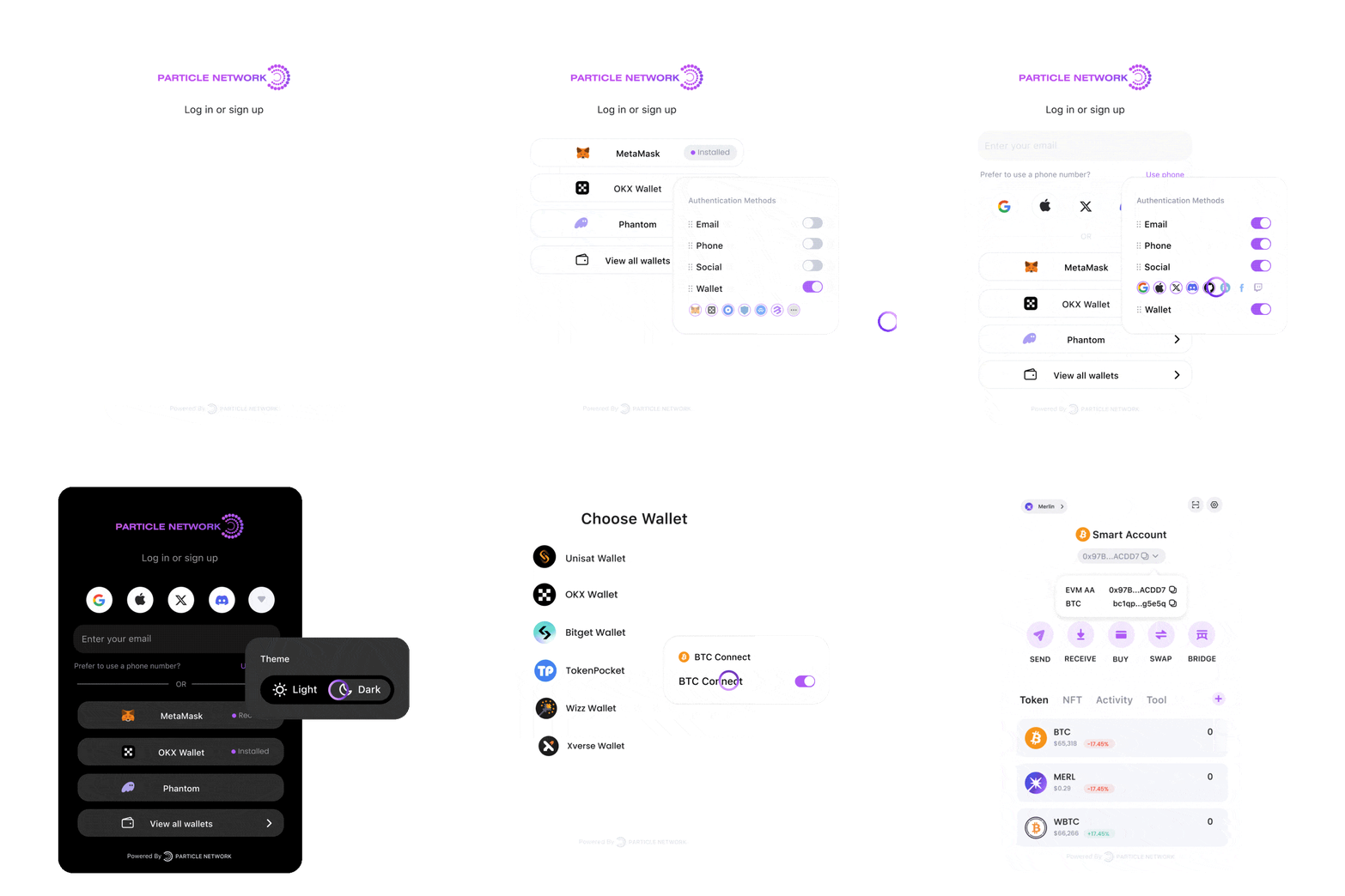 Customization at a higher level is straightforward, with options such as setting **light** or **dark** mode via the `mode` parameter within `createConfig`, selecting the interface language using `language`, or specifying a custom logo through `logo`, among others.
For more granular control, deeper customization is available through the `theme` parameter, part of the `appearance` object in `createConfig`.
The `theme` object accepts the following options:
```ts theme={null}
// Font settings
'--pcm-font-family'?: string;
// Focus and action colors
'--pcm-focus-color'?: string;
'--pcm-body-action-color'?: string;
'--pcm-accent-color'?: string;
// Modal appearance
'--pcm-overlay-background'?: string;
'--pcm-overlay-backdrop-filter'?: string;
'--pcm-modal-box-shadow'?: string;
// Border radius settings
'--pcm-rounded-sm'?: Unit;
'--pcm-rounded-md'?: Unit;
'--pcm-rounded-lg'?: Unit;
'--pcm-rounded-xl'?: Unit;
'--pcm-rounded-full'?: Unit;
// Background colors
'--pcm-body-background'?: string;
'--pcm-body-background-secondary'?: string;
'--pcm-body-background-tertiary'?: string;
// Foreground (Text) colors
'--pcm-body-color'?: string;
'--pcm-body-color-secondary'?: string;
'--pcm-body-color-tertiary'?: string;
// Button appearance
'--pcm-button-border-color'?: string;
'--pcm-button-font-weight'?: string;
'--pcm-button-hover-shadow'?: string;
// Primary Button
'--pcm-primary-button-color'?: string;
'--pcm-primary-button-background'?: string;
'--pcm-primary-button-hover-background'?: string;
// Secondary Button
'--pcm-secondary-button-color'?: string;
'--pcm-secondary-button-background'?: string;
'--pcm-secondary-button-hover-background'?: string;
// Status Colors
'--pcm-error-color'?: HexColor;
'--pcm-success-color'?: HexColor;
'--pcm-warning-color'?: HexColor;
// Wallet Label
'--pcm-wallet-label-color'?: HexColor;
```
Each of these options allows you to customize the appearance of the **authentication modal**, **wallet modal**, and **transaction popups**.
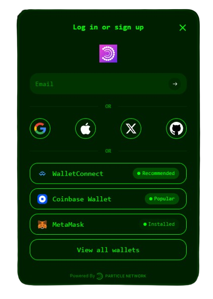
The following example demonstrates how to apply a green hacker theme to **Particle Connect**:
```tsx ConnectKit.tsx theme={null}
const config = createConfig({
projectId: process.env.NEXT_PUBLIC_PROJECT_ID!,
clientKey: process.env.NEXT_PUBLIC_CLIENT_KEY!,
appId: process.env.NEXT_PUBLIC_APP_ID!,
appearance: {
theme: {
// Modal
"--pcm-overlay-background": "rgba(0, 0, 0, 0.85)", // Dark, near-black overlay
"--pcm-overlay-backdrop-filter": "blur(8px)", // Slightly more intense blur
"--pcm-modal-box-shadow": "0px 0px 12px rgba(0, 255, 0, 0.5)", // Green glowing shadow for a hacker vibe
// Background
"--pcm-body-background": "#001f00", // Dark greenish-black background
"--pcm-body-background-secondary": "#002800", // Slightly lighter dark green
"--pcm-body-background-tertiary": "#003300", // Another variation of dark green
// Foreground
"--pcm-body-color": "#00ff00", // Bright green text
"--pcm-body-color-secondary": "#00cc00", // Slightly darker green text
"--pcm-body-color-tertiary": "#009900", // Even darker green text
"--pcm-body-action-color": "#00ff00", // Bright green action color
"--pcm-accent-color": "#00ff00", // Bright green accent color
"--pcm-focus-color": "#00ff00", // Bright green focus color
// Button
"--pcm-button-font-weight": "500",
"--pcm-button-hover-shadow": "0px 0px 8px rgba(0, 255, 0, 0.5)", // Green glowing shadow on hover
"--pcm-button-border-color": "#00ff00", // Bright green border for buttons
// Primary Button
"--pcm-primary-button-color": "#000000", // Black text on buttons (to contrast bright background)
"--pcm-primary-button-bankground": "#00ff00", // Bright green background for primary buttons
"--pcm-primary-button-hover-background": "#00cc00", // Slightly darker green on hover
// Font
"--pcm-font-family": `monospace, 'Courier New', Courier, 'Segoe UI', Helvetica, Arial, sans-serif`, // Monospace font for a hacker style
// Radius
"--pcm-rounded-sm": "6px", // Keep the original rounded values
"--pcm-rounded-md": "12px",
"--pcm-rounded-lg": "18px",
"--pcm-rounded-xl": "24px",
"--pcm-rounded-full": "9999px",
"--pcm-success-color": "#00ff00", // Bright green for success
"--pcm-warning-color": "#ffcc00", // Yellow for warning
"--pcm-error-color": "#ff0000", // Red for error
"--pcm-wallet-lable-color": "#00ff00", // Bright green label color for wallets
},
// The rest of the component
```
Customization at a higher level is straightforward, with options such as setting **light** or **dark** mode via the `mode` parameter within `createConfig`, selecting the interface language using `language`, or specifying a custom logo through `logo`, among others.
For more granular control, deeper customization is available through the `theme` parameter, part of the `appearance` object in `createConfig`.
The `theme` object accepts the following options:
```ts theme={null}
// Font settings
'--pcm-font-family'?: string;
// Focus and action colors
'--pcm-focus-color'?: string;
'--pcm-body-action-color'?: string;
'--pcm-accent-color'?: string;
// Modal appearance
'--pcm-overlay-background'?: string;
'--pcm-overlay-backdrop-filter'?: string;
'--pcm-modal-box-shadow'?: string;
// Border radius settings
'--pcm-rounded-sm'?: Unit;
'--pcm-rounded-md'?: Unit;
'--pcm-rounded-lg'?: Unit;
'--pcm-rounded-xl'?: Unit;
'--pcm-rounded-full'?: Unit;
// Background colors
'--pcm-body-background'?: string;
'--pcm-body-background-secondary'?: string;
'--pcm-body-background-tertiary'?: string;
// Foreground (Text) colors
'--pcm-body-color'?: string;
'--pcm-body-color-secondary'?: string;
'--pcm-body-color-tertiary'?: string;
// Button appearance
'--pcm-button-border-color'?: string;
'--pcm-button-font-weight'?: string;
'--pcm-button-hover-shadow'?: string;
// Primary Button
'--pcm-primary-button-color'?: string;
'--pcm-primary-button-background'?: string;
'--pcm-primary-button-hover-background'?: string;
// Secondary Button
'--pcm-secondary-button-color'?: string;
'--pcm-secondary-button-background'?: string;
'--pcm-secondary-button-hover-background'?: string;
// Status Colors
'--pcm-error-color'?: HexColor;
'--pcm-success-color'?: HexColor;
'--pcm-warning-color'?: HexColor;
// Wallet Label
'--pcm-wallet-label-color'?: HexColor;
```
Each of these options allows you to customize the appearance of the **authentication modal**, **wallet modal**, and **transaction popups**.
The following example demonstrates how to apply a green hacker theme to **Particle Connect**:
```tsx ConnectKit.tsx theme={null}
const config = createConfig({
projectId: process.env.NEXT_PUBLIC_PROJECT_ID!,
clientKey: process.env.NEXT_PUBLIC_CLIENT_KEY!,
appId: process.env.NEXT_PUBLIC_APP_ID!,
appearance: {
theme: {
// Modal
"--pcm-overlay-background": "rgba(0, 0, 0, 0.85)", // Dark, near-black overlay
"--pcm-overlay-backdrop-filter": "blur(8px)", // Slightly more intense blur
"--pcm-modal-box-shadow": "0px 0px 12px rgba(0, 255, 0, 0.5)", // Green glowing shadow for a hacker vibe
// Background
"--pcm-body-background": "#001f00", // Dark greenish-black background
"--pcm-body-background-secondary": "#002800", // Slightly lighter dark green
"--pcm-body-background-tertiary": "#003300", // Another variation of dark green
// Foreground
"--pcm-body-color": "#00ff00", // Bright green text
"--pcm-body-color-secondary": "#00cc00", // Slightly darker green text
"--pcm-body-color-tertiary": "#009900", // Even darker green text
"--pcm-body-action-color": "#00ff00", // Bright green action color
"--pcm-accent-color": "#00ff00", // Bright green accent color
"--pcm-focus-color": "#00ff00", // Bright green focus color
// Button
"--pcm-button-font-weight": "500",
"--pcm-button-hover-shadow": "0px 0px 8px rgba(0, 255, 0, 0.5)", // Green glowing shadow on hover
"--pcm-button-border-color": "#00ff00", // Bright green border for buttons
// Primary Button
"--pcm-primary-button-color": "#000000", // Black text on buttons (to contrast bright background)
"--pcm-primary-button-bankground": "#00ff00", // Bright green background for primary buttons
"--pcm-primary-button-hover-background": "#00cc00", // Slightly darker green on hover
// Font
"--pcm-font-family": `monospace, 'Courier New', Courier, 'Segoe UI', Helvetica, Arial, sans-serif`, // Monospace font for a hacker style
// Radius
"--pcm-rounded-sm": "6px", // Keep the original rounded values
"--pcm-rounded-md": "12px",
"--pcm-rounded-lg": "18px",
"--pcm-rounded-xl": "24px",
"--pcm-rounded-full": "9999px",
"--pcm-success-color": "#00ff00", // Bright green for success
"--pcm-warning-color": "#ffcc00", // Yellow for warning
"--pcm-error-color": "#ff0000", // Red for error
"--pcm-wallet-lable-color": "#00ff00", // Bright green label color for wallets
},
// The rest of the component
```
 For a full guide on configuring Particle Connect, head over to the [quickstart guide](/social-logins/connect/quickstart/web-quickstart).
### Customizing the `ConnectButton` Text
**Particle Connect** enables you to customize the text displayed on the `ConnectButton` component used for user login.
To modify the text, add the `label` **prop** to the `ConnectButton` component:
```tsx theme={null}
```
## Particle AuthKit Customization
As an alternative to Particle Connect, Particle Auth (`@particle-network/authkit`) offers a dedicated modal containing exclusively social logins. The most common way to customize this interface is through programmatic style definitions, which can be applied during SDK initialization through the `AuthCoreContextProvider` component, as will be demonstrated below.
You can achieve high-level customization by adjusting parameters such as `themeType` for light or dark mode within `AuthCoreContextProvider`, `language` to set the language of the modal, and `fiatCoin` to choose the fiat currency display.
For more advanced customization, the `customStyle` parameter in the `options` object of `AuthCoreContextProvider` offers deeper control. The `customStyle` parameter accepts the following options:
```javascript customStyle theme={null}
logo?: string;
projectName?: string;
subtitle?: string;
modalWidth?: number;
modalHeight?: number;
zIndex?: number;
primaryBtnBorderRadius?: number | string;
modalBorderRadius?: number | string;
cardBorderRadius?: number | string;
fontFamily?: string;
theme?: {
dark?: ThemeStyle;
light?: ThemeStyle;
};
```
The `ThemeStyle` object allows you to customize the appearance of the **authentication modal** and **transaction popups**. It provides options for defining various visual elements, including colors, backgrounds, borders, and more.
The `ThemeStyle` object accepts the following properties:
```ts ThemeStyle theme={null}
primaryBtnColor?: string;
primaryBtnBackgroundColor?: string;
secondaryBtnColor?: string;
secondaryBtnBackgroundColor?: string;
textColor?: string;
secondaryTextColor?: string;
themeBackgroundColor?: string;
iconBorderColor?: string;
accentColor?: string;
inputBackgroundColor?: string;
inputBorderColor?: string;
inputPlaceholderColor?: string;
cardBorderColor?: string;
cardUnclickableBackgroundColor?: string;
cardUnclickableBorderColor?: string;
cardDividerColor?: string;
tagBackgroundColor?: string;
modalBackgroundColor?: string;
tipsBackgroundColor?: string;
```
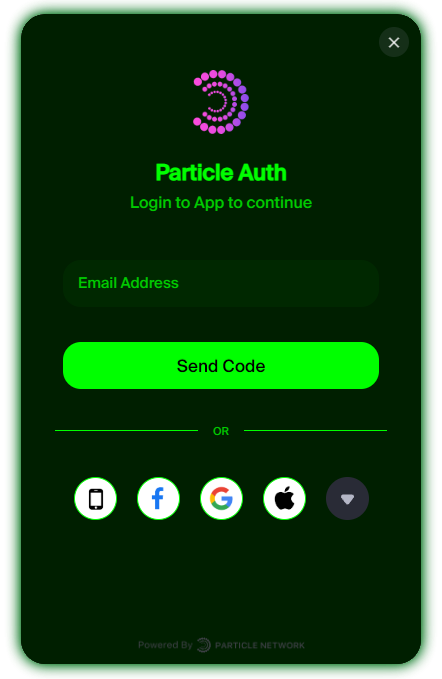
The following example demonstrates how to implement a green hacker theme for the **Particle Auth** login modal:
```tsx theme={null}
For a full guide on configuring Particle Connect, head over to the [quickstart guide](/social-logins/connect/quickstart/web-quickstart).
### Customizing the `ConnectButton` Text
**Particle Connect** enables you to customize the text displayed on the `ConnectButton` component used for user login.
To modify the text, add the `label` **prop** to the `ConnectButton` component:
```tsx theme={null}
```
## Particle AuthKit Customization
As an alternative to Particle Connect, Particle Auth (`@particle-network/authkit`) offers a dedicated modal containing exclusively social logins. The most common way to customize this interface is through programmatic style definitions, which can be applied during SDK initialization through the `AuthCoreContextProvider` component, as will be demonstrated below.
You can achieve high-level customization by adjusting parameters such as `themeType` for light or dark mode within `AuthCoreContextProvider`, `language` to set the language of the modal, and `fiatCoin` to choose the fiat currency display.
For more advanced customization, the `customStyle` parameter in the `options` object of `AuthCoreContextProvider` offers deeper control. The `customStyle` parameter accepts the following options:
```javascript customStyle theme={null}
logo?: string;
projectName?: string;
subtitle?: string;
modalWidth?: number;
modalHeight?: number;
zIndex?: number;
primaryBtnBorderRadius?: number | string;
modalBorderRadius?: number | string;
cardBorderRadius?: number | string;
fontFamily?: string;
theme?: {
dark?: ThemeStyle;
light?: ThemeStyle;
};
```
The `ThemeStyle` object allows you to customize the appearance of the **authentication modal** and **transaction popups**. It provides options for defining various visual elements, including colors, backgrounds, borders, and more.
The `ThemeStyle` object accepts the following properties:
```ts ThemeStyle theme={null}
primaryBtnColor?: string;
primaryBtnBackgroundColor?: string;
secondaryBtnColor?: string;
secondaryBtnBackgroundColor?: string;
textColor?: string;
secondaryTextColor?: string;
themeBackgroundColor?: string;
iconBorderColor?: string;
accentColor?: string;
inputBackgroundColor?: string;
inputBorderColor?: string;
inputPlaceholderColor?: string;
cardBorderColor?: string;
cardUnclickableBackgroundColor?: string;
cardUnclickableBorderColor?: string;
cardDividerColor?: string;
tagBackgroundColor?: string;
modalBackgroundColor?: string;
tipsBackgroundColor?: string;
```
The following example demonstrates how to implement a green hacker theme for the **Particle Auth** login modal:
```tsx theme={null}
 For a full guide on configuring Particle Auth, head over to the [quickstart guide](/social-logins/auth/quickstart/web-quickstart).